PRESENCE Magazine
Brand Guide
As the very first image to represent the essence of the journal PRESENCE, the two Mastheads/logos alternate from issue to issue to communicate the constant ebb + flow of Spirit and the evolving nature of SDI. One evokes SDI’s logo in depth with its purple gradient representing the Universe and its stars
Typography
Typography is one of the most important design elements. It creates brand consistency + recognition throughout the publication. The type families chosen were chosen for their legibility above all else. The font families chosen have an abundant number of possibilities to choose from to communicate well the content of each page.
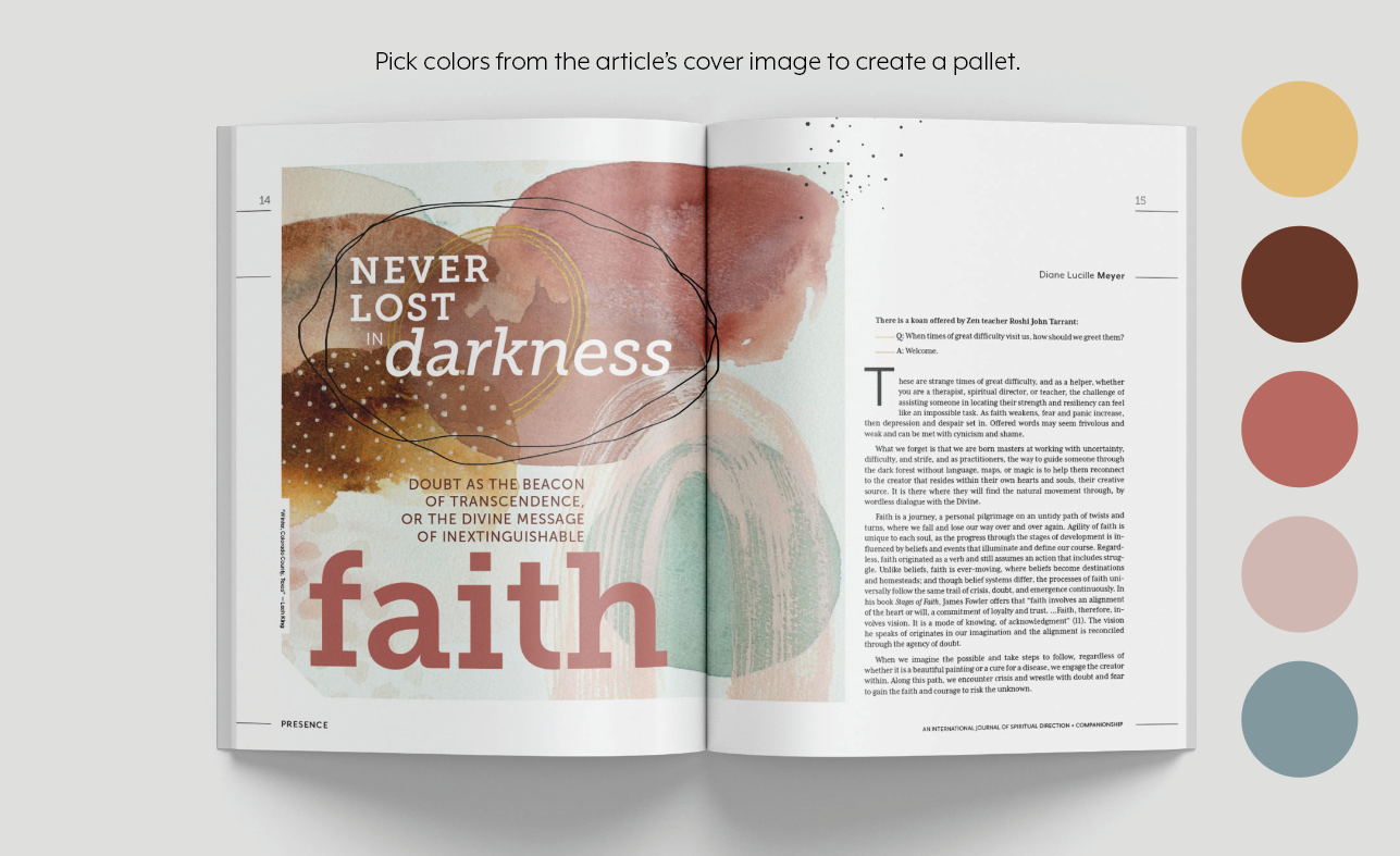
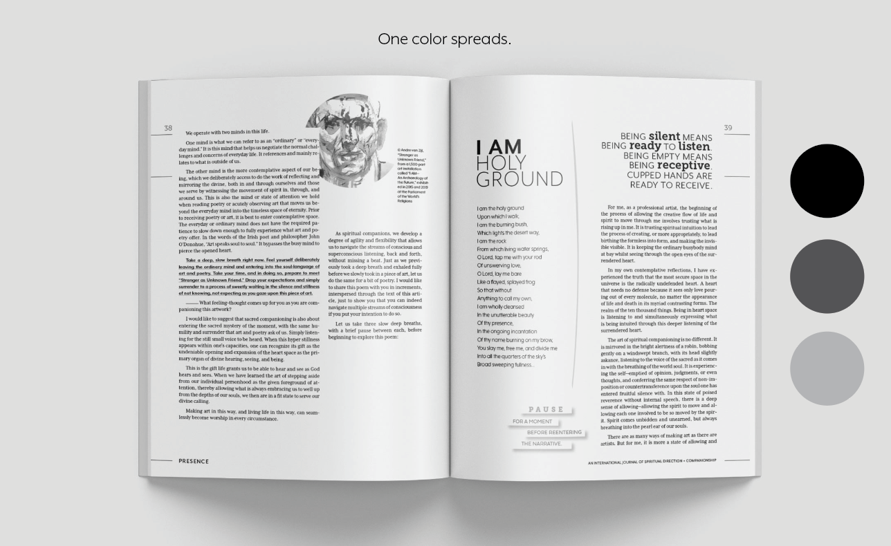
COLORS
SDI Color Scheme
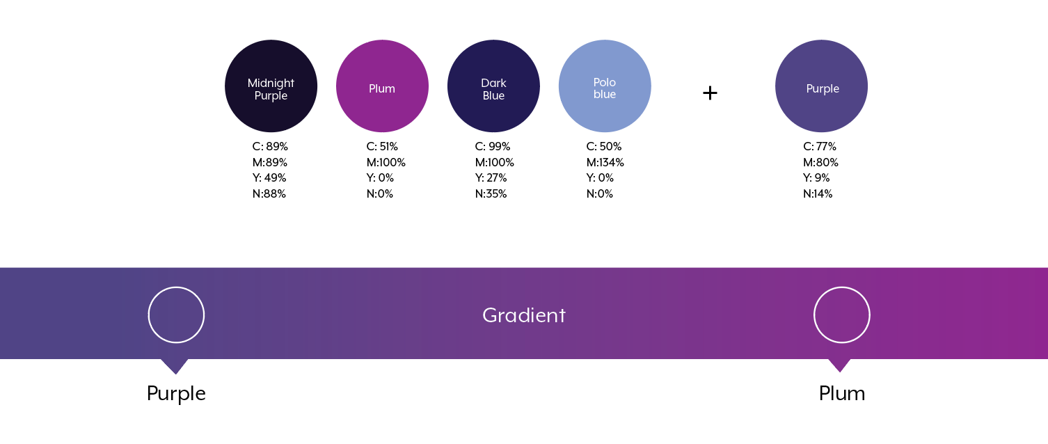
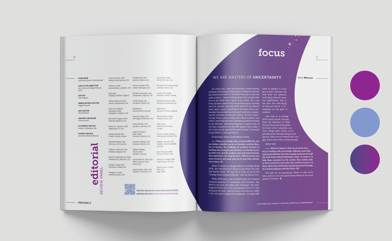
Secondary color Scheme
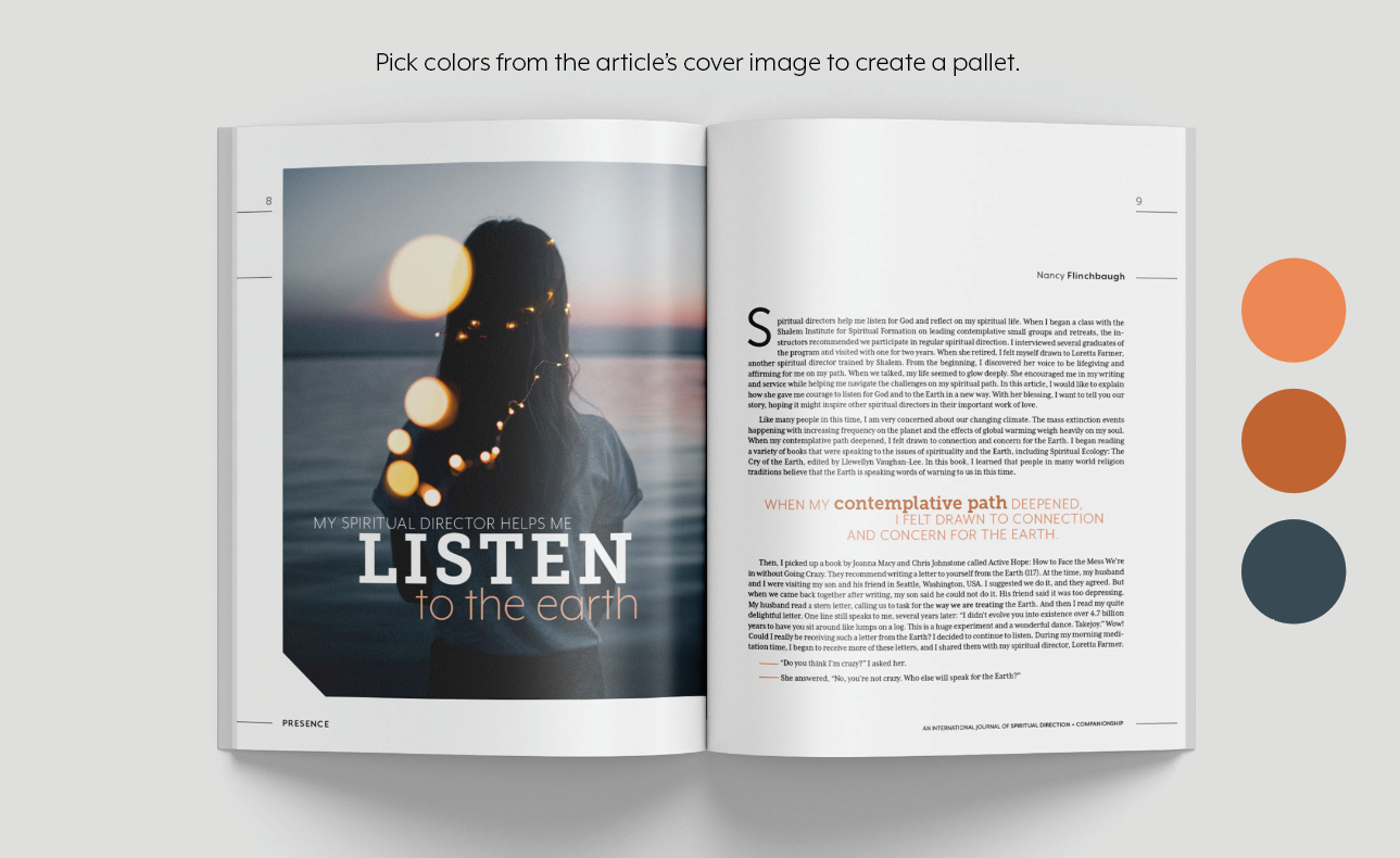
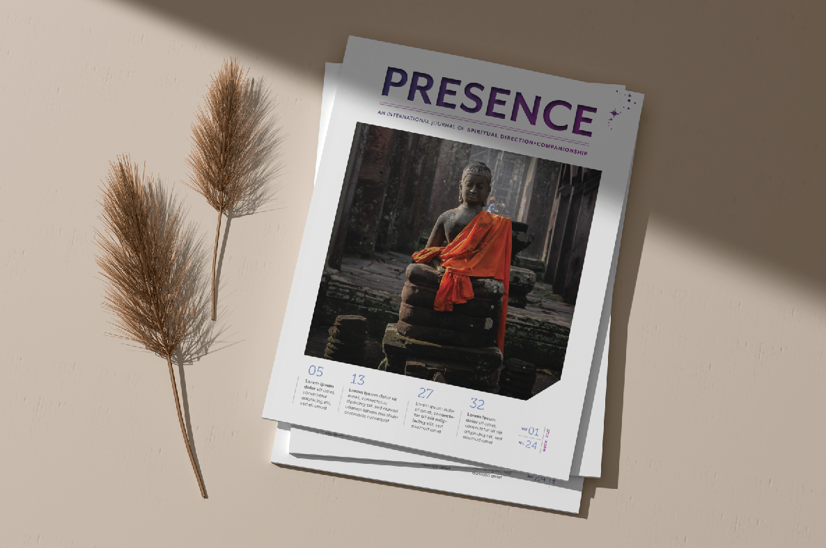
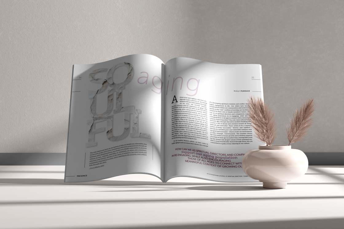
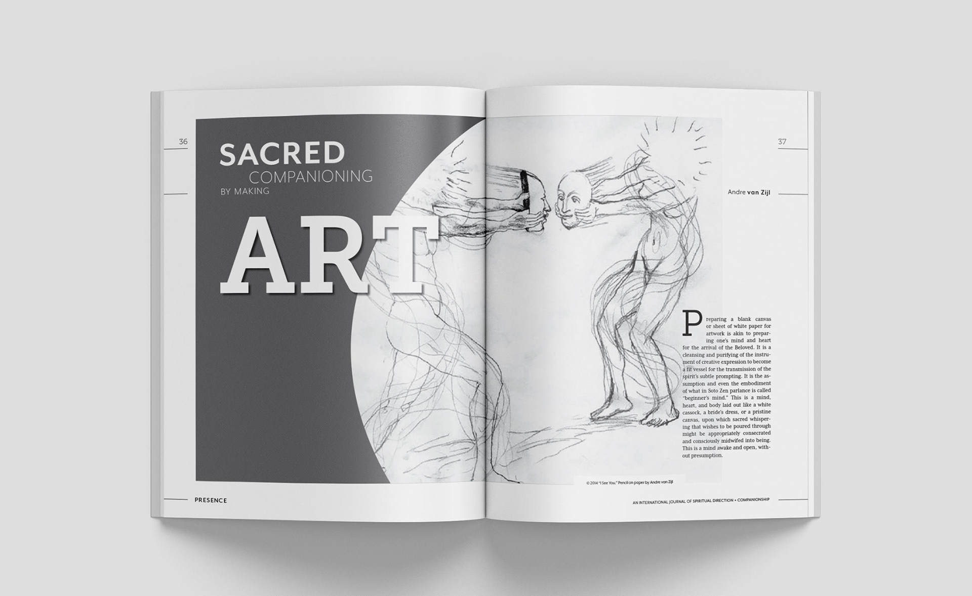
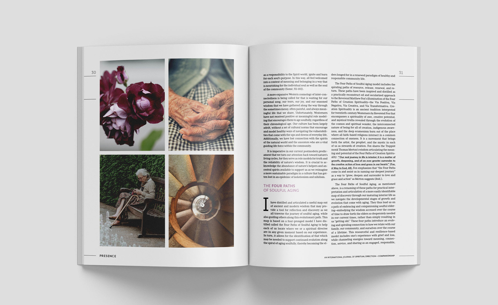
PHOTOGRAPHY AND ART
Photography, illustrations and artwork are a key elements in Presence’s brand.
It is important to keep the style and tonality of the photographs homogeneous.
It is important to keep the style and tonality of the photographs homogeneous.
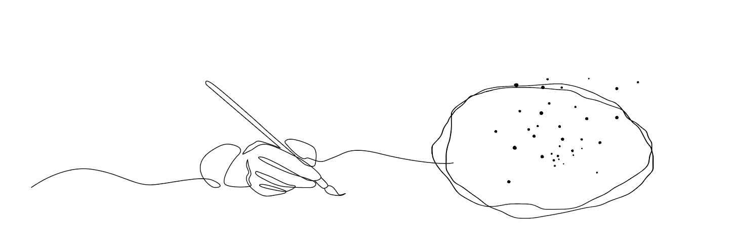
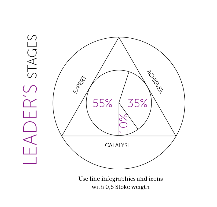
ILLUSTRATIONS & INFOGRAPHICS